Best Box Plot Calculator: Top 5 Tools Compared
Finding the Best Box Plot Calculator: An Introduction
When it comes to visualizing data distributions, box plots (or box-and-whisker plots) are invaluable tools. They succinctly summarize key statistical measures, such as the median, quartiles, and potential outliers. However, with numerous online tools available, finding a reliable box plot calculator can be a daunting task. Users often face challenges such as inconsistent outputs, cumbersome interfaces, and a lack of educational resources to help interpret results.
This article aims to streamline your search by reviewing and ranking the top box plot calculators currently available online. Our goal is to save you time and effort by providing a curated list of tools that excel in accuracy, usability, and features. Whether you are a student, a researcher, or simply someone looking to analyze data, having access to a dependable box plot calculator is essential for effective data visualization.
Criteria for Ranking
To evaluate these calculators, we employed several criteria. Accuracy is paramount; we focused on tools that produce reliable outputs based on the entered data. Ease of use is also crucial; a user-friendly interface can make the process of generating box plots straightforward, even for those with minimal statistical background. Additionally, we considered features such as the ability to handle large datasets, export options, customization of plot appearance, and the inclusion of educational resources to aid users in understanding the results.
Join us as we delve into the best box plot calculators, ensuring you can efficiently visualize your data with confidence.
Our Criteria: How We Selected the Top Tools
Criteria for Selecting the Best Box Plot Calculators
When evaluating online box plot calculators, we focused on several key criteria to ensure that users can find a tool that meets their needs effectively. Here are the essential factors that guided our selection process:
-
Accuracy and Reliability
The primary purpose of any statistical tool is to provide accurate results. We assessed the calculators based on their ability to compute the five-number summary (minimum, first quartile, median, third quartile, and maximum) and identify outliers correctly. Tools that utilize established statistical methods, such as the 1.5 * IQR rule for outlier detection, were prioritized. -
Ease of Use
User-friendliness is crucial for ensuring that both beginners and experienced users can navigate the calculator without frustration. We looked for interfaces that are intuitive, allowing users to input data easily—whether through typing, pasting, or uploading files. The presence of clear instructions and helpful tooltips enhances usability. -
Key Features
A robust box plot calculator should offer a range of features that enhance its functionality. We considered tools that provide:
– Multiple Input Methods: Options to input raw data or summary statistics.
– Data Sorting and Outlier Highlighting: Features that sort data points and visually highlight outliers in the generated plot.
– Visualization Options: The ability to customize the orientation (horizontal or vertical) and color themes of the box plot.
– Export Capabilities: Options to export plots in various formats (e.g., SVG, PNG, CSV) for further analysis or presentation. -
Cost (Free vs. Paid)
Accessibility is a significant factor in our selection process. We included a mix of free and paid tools, ensuring that users can find reliable options without financial constraints. Tools that offer comprehensive features without requiring payment were especially valued. -
Educational Resources
Given that many users may be new to box plots and their interpretation, calculators that provide additional educational resources—such as explanations of box plot components, FAQs, and examples—were favored. This added value aids users in understanding how to interpret their results effectively. -
Performance and Load Times
Fast loading times and efficient performance are essential for a smooth user experience, especially when handling large datasets. We tested each tool to ensure it can manage data input without significant delays. -
User Reviews and Feedback
We considered user ratings and reviews to gauge the overall satisfaction of those who have used the tools. Positive feedback regarding reliability, ease of use, and the effectiveness of features contributed to our assessments.
By using these criteria, we aimed to curate a list of the best box plot calculators that cater to a wide range of users, from students to professionals, ensuring they can visualize their data effectively and accurately.
The Best Box Plot Calculators of 2025
1. Statistics Calculator: Box Plot
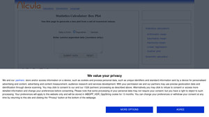
The Statistics Calculator: Box Plot from alcula.com is an online tool designed to generate box plots from user-provided statistical data. Users can easily input their data into a text box, and the tool will create a visual representation that highlights key statistical features such as the median, quartiles, and potential outliers. This user-friendly interface makes it a practical resource for students and professionals looking to analyze data distributions effectively.
- Website: alcula.com
- Established: Approx. 19 years (domain registered in 2006)
2. Box Plot Calculator – Create a Box
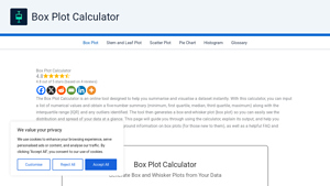
The Box Plot Calculator is a user-friendly online tool designed to create box-and-whisker plots quickly and efficiently. By simply entering your data, the calculator generates a comprehensive 5-number summary, identifies outliers, and calculates the interquartile range (IQR). Within seconds, users receive a clear visual representation of their data, making it an invaluable resource for data analysis and presentation.
- Website: boxplotcalculator.com
- Established: Approx. 0 years (domain registered in 2025)
4. Box Plot Calculator
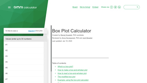
The Box Plot Calculator from Omni Calculator provides users with a visual representation of their dataset through a box-and-whisker plot. This tool simplifies graphic analysis by allowing users to input their data and instantly generate a clear, informative box plot, which effectively highlights key statistical measures such as median, quartiles, and potential outliers. Ideal for data analysis, it enhances understanding of data distribution at a glance.
- Website: omnicalculator.com
- Established: Approx. 11 years (domain registered in 2014)
5. Box Plot Calculator
The Box Plot Calculator at calculator-online.net is a user-friendly tool designed to generate box and whisker plots from a given dataset. Users simply enter their data values and click ‘Calculate’ to visualize statistical summaries, including medians and quartiles. This intuitive calculator streamlines the process of creating informative box plots, making it an essential resource for students and professionals seeking to analyze and present data effectively.
- Website: calculator-online.net
- Established: Approx. 12 years (domain registered in 2013)
How to Get the Most Accurate Results
Double-Check Your Inputs
Accuracy in box plot calculations starts with the data you enter. Ensure that you carefully input your numerical values, separating them correctly with commas, spaces, or tabs as required by the calculator. It’s advisable to double-check for any typos or extraneous characters that may skew your results. If your dataset is large, consider using a spreadsheet to organize your numbers before pasting them into the calculator. Make sure you have at least four data points, as many calculators require this minimum to generate a box plot effectively.
Understand the Underlying Assumptions
Different box plot calculators may use slightly different methods for calculating key metrics like quartiles and outliers. Familiarize yourself with the underlying statistical principles, particularly the interquartile range (IQR) and how outliers are defined. Most calculators utilize the common 1.5 * IQR rule for identifying outliers, but it’s helpful to know what this means and how it affects your data. Understanding these assumptions will help you interpret your results more accurately.
Use Multiple Tools for Comparison
To ensure the reliability of your results, consider using multiple box plot calculators. Each tool may present data differently or have unique features that could yield slightly varied results. By cross-referencing results from different calculators, you can gain a more comprehensive understanding of your dataset’s characteristics. This practice is particularly beneficial if you notice significant discrepancies, prompting a closer examination of your data inputs or the calculation methods used.
Familiarize Yourself with the Output
Take the time to understand the output provided by the box plot calculator. Most tools will give you a five-number summary (minimum, Q1, median, Q3, and maximum) along with visual representations of the data. Familiarizing yourself with these outputs will enable you to make informed decisions based on your data. For instance, knowing how to interpret the median’s position within the box and the lengths of the whiskers can provide insights into data skewness and variability.
Interpret Outliers with Caution
Outliers can significantly influence your analysis, so it’s crucial to interpret them carefully. While they may indicate unusual data points worth investigating, they could also result from data entry errors or other anomalies. Use the box plot to visualize these outliers and decide whether they should be included in your analysis or excluded for clarity. Always document your rationale for including or excluding any outliers, as this can be important for future reference or reporting.
Keep Learning
Finally, don’t hesitate to deepen your knowledge of box plots and statistical analysis. Understanding the theory behind the data visualization can enhance your analytical skills and improve your ability to interpret results accurately. Numerous online resources, tutorials, and courses can help you become more proficient in data analysis, allowing you to make the most of box plot calculators and other statistical tools.
Frequently Asked Questions (FAQs)
1. What is a box plot calculator, and how does it work?
A box plot calculator is an online tool that allows users to visualize the distribution of a dataset through a box-and-whisker plot. To use it, you typically input a set of numerical values, either by typing them in directly or pasting them from another source. The calculator then computes key statistical measures, including the minimum, first quartile (Q1), median, third quartile (Q3), maximum, and interquartile range (IQR). It generates a graphical representation of these values, highlighting the central tendency, spread, and any outliers present in the data.
2. How do I enter my data into a box plot calculator?
Most box plot calculators accept data in various formats. You can usually enter your numerical values as a comma-separated list, or on separate lines. Some calculators also allow you to paste data directly from spreadsheets or documents. It’s important to note that you typically need to provide at least four data points for the calculator to generate a meaningful box plot. Once you’ve entered your data, simply press the “Submit” or “Generate” button to create the plot.
3. What are the key components of a box plot?
A box plot consists of several key components:
– The Box: This represents the interquartile range (IQR) and is drawn from Q1 (25th percentile) to Q3 (75th percentile).
– The Median Line: Inside the box, a line indicates the median (Q2), which divides the data into two equal halves.
– The Whiskers: Lines that extend from the box to the minimum and maximum values of the dataset, excluding outliers.
– Outlier Points: Individual markers that represent data points lying outside the whiskers, indicating values that are significantly higher or lower than the rest of the data.
4. How does the box plot calculator identify outliers?
Outliers are identified using the interquartile range (IQR) method. The calculator calculates fences using the formula:
– Low outlier fence: ( Q1 – 1.5 \times IQR )
– High outlier fence: ( Q3 + 1.5 \times IQR )
Any data points that fall below the low fence or above the high fence are considered outliers. These outliers are then visually represented on the box plot, often marked as individual points outside the whiskers.
5. Can I customize the appearance of my box plot?
Yes, many box plot calculators offer customization options for the appearance of the box plot. Users can often choose the orientation (horizontal or vertical), select color themes, and adjust other visual settings to enhance readability and presentation. Additionally, some calculators allow you to export the box plot in various formats, such as SVG or PNG, for use in reports or presentations.
Important Disclaimer
⚠️ Important Disclaimer
The information and reviews in this guide are for educational purposes only and are based on publicly available information. We are not affiliated with any of the tools mentioned. Features and pricing may change. Always conduct your own research before choosing a tool for your needs.
